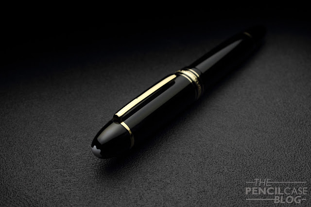
Something strange happened: I bought a Montblanc! I'm generally not THAT big on MB pens, but still this felt like quite a milestone in my collection. You see, the Montblanc Meisterstück 149 is kind of an icon. It's a must-have for every real collector... or at least that's what they tell you!
To some extent, I definitely agree. The 149 is the ultimate depiction of a fountain pen. Ask anyone to draw a fountain pen from memory, and you'll get something like this. Hell, there's at least a dozen brands that decided to eh, well... 'mimic' the design of the Montblanc Meisterstück fountain pen, I guess that says plenty.
Montblanc's Meisterstuck line (including the classic 149) achieved its luxury status and name recognition all across the globe. This is largely due to their excellent marketing that has established their 'high-end' status as a brand. But it's also just because of the great aesthetics of their pens. You see, the Montblanc Meisterstück is kind of a crowd pleaser. It's a simple, black resin pen, gold trims (also available with platinum and rose gold trim, but the yellow gold started it all), and well...not much more.
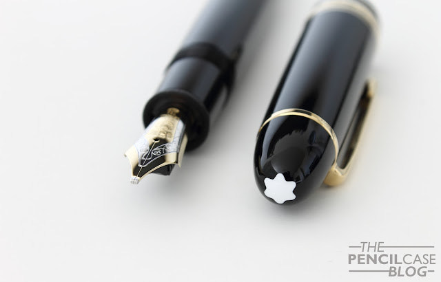
On the outside there's of course the white star logo, and some decorative bands, including the triple band around the base of the cap. But other than that, it's a clean and clutter-free design. The simple cigar shape is easy on the eyes. Even for a large pen like this, nothing about the design feels extravagant or out of place. It's timeless and elegant, chic but not gaudy.
It's this delicate balance that makes it so attractive for a wide audience, especially for business people that want a classy pen. But of course that white star has also become a symbol for luxury and wealth, so everyone will see that you just spent a ton on a fountain pen. Depending on the situation, I guess that can be both good and bad. In my case, I think this 'status' associated with Montblanc detracts a bit from the overall experience. It's perhaps a bit too much of a class symbol instead of just a nice pen.
It's this delicate balance that makes it so attractive for a wide audience, especially for business people that want a classy pen. But of course that white star has also become a symbol for luxury and wealth, so everyone will see that you just spent a ton on a fountain pen. Depending on the situation, I guess that can be both good and bad. In my case, I think this 'status' associated with Montblanc detracts a bit from the overall experience. It's perhaps a bit too much of a class symbol instead of just a nice pen.
But to get back to the point, the Meisterstück is a classy yet simple pen. So much so, that it may actually seem a bit boring, I guess? With all the colorful and over the top flashy pens that are on the market these days, I'm sure that 99% of us pen addicts would much rather like to see Montblanc use different and more exciting materials. If you ever saw Sarj's (aka. the one man pen show) Custom-made 149 in Omas Arco brown celluloid... oh boy that's something else!
 |
| L to R: Pilot 823, Pelikan M800, Pelikan M1000, Visconti Homo Sapiens OS, Montblanc 149, Lamy Safari, Lamy 2000 |
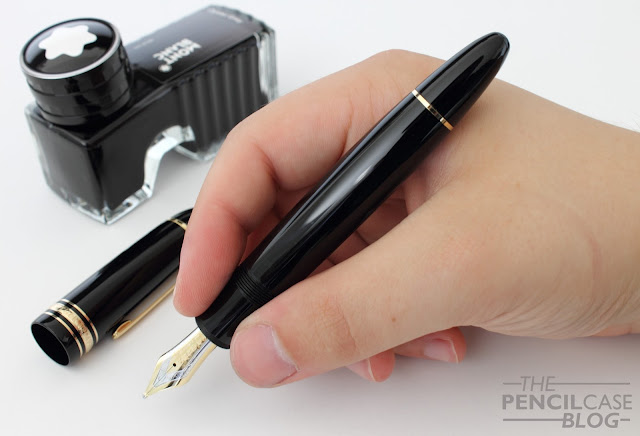
However, one thing is certain: when it comes to size, the 149 is far from boring. This is a truly oversized pen, measuring in at 14.7 cm (5.78") capped, and 13.2 cm (5.2") uncapped. With a width of around 1.6 cm (0.63") at the widest point, and 1.3 cm (0.51") at the section, it's a pretty fat pen.
Because of this girth, the 149 will be a bit too large for a lot of people. In terms of usability, I feel like the 146 does a better job at being a comfortable and versatile writer, with a more reasonable diameter while remaining a comfortable length (The 146 is actually not much shorter than the 149!).
The 149 has gone through countless iterations throughout the years. The early versions were coveted for their softer nibs and ebonite feeds, and some versions also had a metal piston mechanism. Later versions came with plastic mechanisms, but the current models are again equipped with a metal mechanism. In terms of durability that's a huge plus, but the weight of the pen also benefits from this. The 149 weighs 32 grams in total, and the barrel is slightly more substantial because of the mechanism. It doesn't throw off the balance, but it's just enough to let you know you're writing with a large pen. Same as with the Pelikan M800 and M1000, that metal mechanism makes the 149 feel more premium and durable, even though it's still a resin pen.
What it's all about for me is the nib. Dennis (from La Couronne Du Comte) showed me a couple different 149's with different nib sizes, but it was quite an easy choice. I obviously went for the biggest nib he had in stock, which is this fantastic double broad!
The #9 (which is MB language for a #8 size nib) two-tone 18k gold nib looks and writes fantastic. It may be my favourite part about the entire pen. The design of the nib face is classy and somewhat vintage-esque (The imprint design has remained largely the same throughout the years), and it's partially rhodium-plated to accentuate the design.
If I'm being really picky, perhaps the plating could've been done a bit more precise. The rhodium layer doesn't always perfectly align with the stamped design. But that's a minor detail, and you really have to look at it with a magnifying glass to see it.
Going for the BB nib was an obvious choice. I had tried a 149 with BB nib from a friend (Hey Marco! Check him out on Instagram!) and was immediately sold on the lush, wide and stub line characteristic this stock nib provides. The way these nibs are ground is quite interesting. The shape of the tipping material is almost identical to what you'd expect from a stub, instead of the usual round shape. Line variation is perhaps not as pronounced as with a 'real' stub. But on the other hand it is smoother and a bit more forgiving about the writing angle. The ink flow is rather heavy, which is good for a wide nib like this. Because of the size of the nib, it has a tiny bit of springiness, just to give the writing experience a 'cushioned' feel. It's definitely not a flexible nib by any means though.
Overall, this is by far the best Montblanc nib I've used so far. Others were a bit inconsistent (a medium that wrote like a fine, and vice versa), but this one was exactly the way I expected it to be. The stub-like character makes it a bit more special and fun to write with than a normal round nib, which is a welcome extra on a pen in this price range.
The 149 is a great pen. It's ultra-classy and stylish, and the writing experience has been nothing short of amazing. It writes like an 800 euro pen should, and then some. The fact that they still offer 'novelty' nib sizes, including a range of obliques and double broads, is also quite interesting for those that like something a little more exciting than fine or medium.
Yet I'm still having mixed feelings about the 149. I'm glad that I now own a Montblanc, but at the same time I don't feel like I need more of them. There are so many wonderful brands out there with more exciting designs and less jaw-dropping prices. It's a great pen, but it's not a pen that'll speak to everyone's imagination.
Yet I'm still having mixed feelings about the 149. I'm glad that I now own a Montblanc, but at the same time I don't feel like I need more of them. There are so many wonderful brands out there with more exciting designs and less jaw-dropping prices. It's a great pen, but it's not a pen that'll speak to everyone's imagination.
The Montblanc Meisterstück 149 retails for 775 EUR (yellow or rose gold trim) or 805 EUR for the platinum trim version (MSRP of 935-985 USD in the US), which is undoubtedly a lot of money. A lot of 149's are sold on the second hand market for a fraction of the cost. In this case, buying used is a great option if you want to make it a bit less painful for your wallet, but you have to know what to look for (and you should always be wary of fake Montblanc products that are unfortunately very common!)
Note: La Couronne Du Comte is a sponsor of this blog. This product was bought from LCDC with my own funds, and I was in no way solicited or influenced in the making of this post. This post does not contain affilate links.
 |
| I guess I'll never learn to NOT use light inks for my written reviews... |


Loved your article!
ReplyDelete