Karas Pen Co. (The new brand name for Karas Kustoms' writing-related products) is, despite the new name, of course not a newcomer to the writing industry. We all know them for their rather rugged, machined metal pens. Beceause of this 'built to last a lifetime' design philosophy, their products speak mostly to the EDC community. Their pens that are made to be used and carried, designed to withstand daily use.
That's not to say that their metal pens, such as the Retrakt, Ink or Render-K don't get any attention from our writing community (which often overlaps with the EDC community anyway). But it's clear that their more rugged designs, and mostly all-metal construction don't speak to everyone. We can be quite picky about our pens, and Karas Kustoms knows that. So they 'branched' out with their latest pen design: the Decograph!
In a way, the Decograph is a clear departure from their earlier products. It's a more refined and elegant pen, and it's made of acrylic instead of metal. But then at the same time, it still carries their signature style. It's got a retro-ish look to it, sort of art-deco and industrial at the same time.
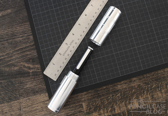
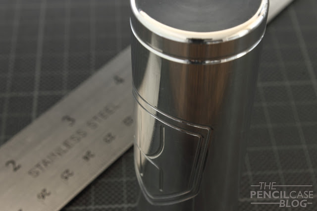
Yet they didn't entirely leave the machined metal scene for this one... The Decograph comes in a one-of-a-kind custom machined aluminium tube that doubles as a carrying case/desk stand! The first impression when you open the box: wow! The case, machined from a solid rod of aluminium, has the Karas Kustoms logo machined on the lid and it feels incredibly solid. Uncapping the tube takes a few turns which really feels like you're dissasembling some heavy machinery or something. It guess you could consider this a nod to their history, showing off the expertise KK has built up over the years of building and tuning hot rods.
But of course we're not here for the case, no matter how cool it is. Let's talk about the pen...
The flattop cigar shape has a rather wide and large cap, which I think emphasizes the strong taper of the body of the pen. This pen has curves, where other Karas pens usually had a more straight and bulky design.
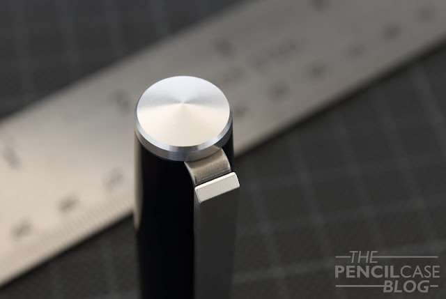
The finials on both cap and barrel are aluminium. The one on the cap has a slightly pointed shape, whereas the bottom finial is slightly hollowed out and has the Karas Kustoms logo machined inside it. The branding on the bottom finial is also the only branding on the entire pen (apart from the bock-branded nib), which is a nice touch to keep a clean look.
The clip is one of the main attention points of the pen, with a uniquely machined aluminium design, attached to a spring stainless steel connection piece. The beveled edges give the clip a streamlined and refined look, while the two-part design of the clip keeps some of that Karas Kustoms ruggedness. The clip is definitely the main design element on this pen, and I think they did a good job on the design. Clips, for me, are a purely aesthetic element, but in this case the spring steel actually makes it quite functional. it's still a relatively stiff clip, but it's definitely more usable than the ultra stiff solid steel clips on other KK pens I've tried.
The black thermoplast material (which is one of the standard color options available, alongside seasonal limited edition materials) is most likely a regular acrylic as you would find from other brands. The term 'thermoplast' sounds quite space-age, but it's just a technical term really.
The plastic parts are all polished manually. You can still faintly see the machining lines of the CNC process. In my opinion, the semi-glossy finish gives it the look and feel of black ebonite, which is quite nice. For some reason, this pen feels really pleasant in the hand.
 |
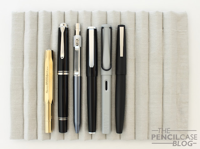
| L to R: Kaweco Brass Sport, Pelikan M805, Karaskustoms Retrakt, Karaskustoms Decograph, Lamy Safari, Lamy 2000 |
Measuring in at 13.7cm (5.39") capped, and 12.7cm (5") uncapped, the decograph is a moderately sized pen. I originally anticipated it to be rather large, as it could be seen as KK's current 'flagship' pen. But instead they chose to go for a more manageable size that will probably fit a lot of users. Uncapped, it hits the sweetspot for me, but it can also be posted. The cap attaches firmly to the barrel when posted. Due to the lightweight construction of just over 20 g total, posting the cap doesn't make it terribly unbalanced (although it does shift the balance more towards the back). With a relatively wide maximum diameter of 1.5cm (0.6") around the cap, it appears quite stout.
The section has an average diameter of around 1 cm (0.4"), and has a strong concave shape which makes it very pleasant to hold. Being the first Karas pen without a metal section will probably also appeal to a lot of people that find metal sections too slippery. Behind the section is a relatively sharp step towards the threads. The threads themselves are unobtrusive, but the step towards the threads is noticeable. This would be the only minor downside I could think of in terms of comfort. It's a very comfortable pen to write with, due to the combination of a large, comfortable section, good dimensions and low overall weight.
The nib is a standard bock #6 nib. Not a whole lot to talk about, other than that it writes well and does what it's supposed to do. This particular medium (not indicated on the nib itself, but Karas Kustoms utilizes a color code on the nib housing to indicate nib size) is a smooth one with a balanced flow. It's a nice writer, what more can I say?
Optional titanium nibs are available at a 45USD premium, while 14k gold nibs command a 105 USD surplus over the steel nibs. Personally I think Bock's steel nibs are good enough so I rarely consider the premium myself. Although at one point I suppose I'll HAVE to try out those gold nibs...just because, right?
Overall, I think Karas Kustoms did a great job with their latest creation. It's right in there with other US-based brands like Edison and Franklin-Christoph, with a price point of 165 USD. The superlative packaging is a nice extra (especially when you give this as a gift!), and the pen itself is on the level of quality we've come to expect from KK.
If you're looking for a more playful and colorful material, there's a semi-translucent green option available as a standard choice. But you can also wait for the limited edition releases that will occur every so often. These are very limited production runs of special acrylics that will definitely speak to a lot of people! The recent 1702 Elektron LE appealed to me a lot, but unfortunately it sold out incredibly fast (you can still read Ed Jelley's review about it HERE. Honestly check out the amazing photos he took of this pen!)
If you're looking for a more playful and colorful material, there's a semi-translucent green option available as a standard choice. But you can also wait for the limited edition releases that will occur every so often. These are very limited production runs of special acrylics that will definitely speak to a lot of people! The recent 1702 Elektron LE appealed to me a lot, but unfortunately it sold out incredibly fast (you can still read Ed Jelley's review about it HERE. Honestly check out the amazing photos he took of this pen!)
Note: This product was provided by Karas Kustoms (Karas Pen Co.), free of charge, so I could write this review. I was in no way influenced in the making of this review, the opinions shared in this review are completely my own! This post does not contain affilate links.


I came across your blog when searching for a comparison between two Karas Kustoms fountain pens. I saw your review of the Pony Express special edition of the Ink V2 and I've now read your Decograph review.
ReplyDeleteI'm considering one of the Karas fountain pens. Right now it's down to the Ink V2 (probably a Grey with a Copper Grip) or an AL13 version of the Decograph. There is only $5 difference between the two (configured as I would like). I was wondering about the differences in feel between the Decograph (especially the AL13 version) and the Ink V2. Can you compare and contrast?
Hey Jim, Thanks for reading!
DeleteI don't have an Al13 version of the Decograph to compare to, but hopefully I'll be able to get my hands on some of the newer versions of the Decograph to make exactly this comparison with the different material options! From what I DO know so far, the Decograph is marginally smaller than the Ink, but noticeably more streamlined and a bit slimmer. This impacts the weight (all-aluminium Ink V2 is 10 grams heavier than the Al13 Decograph) and possibly also the balance.
As said, I hope to be able to compare them side-by-side this year for a more complete view, but at least I hope this can already give you more or less an idea!
How funny. I came across this during my search for more information on the Brass Decograph. I did end up getting the Ink V2 in grey with copper section, and later got an AL13 Decograph in red with black furniture. I'm now looking for a brass Decograph but they seem to be out of stock on a lot of their brass pens at the moment.
Delete