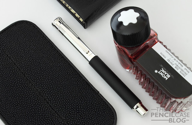
Otto Hutt is a German-based brand that has been on my radar for a while now. It's not one you come across very often, at least not in local shops where I live. I was contacted recently by a shop that does carry the brand, UK-based Pen Heaven, to see if I was interested in taking a look at an Otto Hutt pen - Sure!
The pen they sent me happens to be a design that I'm personally quite fond of: the 'Design 04'. Before we begin, let's start with the elephant in the room. Yes, the Otto Hutt Design 04 looks a bit like that other German pen: the Graf von Faber-Castell Classic! Otto Hutt takes a slightly more modern and clean-looking design route though, compared to the more classic styling of the Graf.
Otto Hutt's history goes way back to the early 20th century. Since the beginning, they have specialized in silver pocket utensils and writing instruments. Their knowledge as silversmiths still shows today, as their product catalog features quite a few pens with elements of sterling silver. The Design 04 has a large section of sterling silver incorporated in the cap, the rest is platinum-coated metal. I like the fact that they offer (partial) sterling silver pens at decent prices. The slight difference in color between the silver and platinum-plated parts is noticeably in some areas where they meet, but it's not bothersome.
The design of the 04 is a nice combination of classic and modern design. The straight cap with flared out finial has a very vintage-esque appearance. But the straight rectangular spring-loaded clip offers a modern counterbalance in the mix. The barrel is available in a wide variety of glossy, matte, or textured surface finishes. In this case, the metal barrel has a matte black finish with diamond guilloche pattern. The complete package is a classy, clean looking pen. Very business-y but also elegant!
 |
| I love the Otto Hutt logo: a minimal representation of a nib! |
One thing worth pointing out is the branding on the pen. I'm personally a fan of minimal branding, Otto Hutt clearly isn't.... The Model 04 has six different engravings scattered across the outside of the pen, as you can see pictured below. I can get that they put the brand name, serial number, land of origin, and even the required silver hallmarks on their pens. But if that's not enough, they also decided to mark each part that isn't sterling silver, with the word 'metal'.
It's just too much, and especially the 'metal' engraving just seems like something you'd put on a cheap Chinese knockoff pen, not a 150$ one. It's not really a flaw or a mistake, but it's unnecessary and it distracts from the clean design. Just getting rid of the 'metal' engravings would already be a huge improvement I think.
The side of the cap is an ideal blank space for personal engravings. My review pen came with my initials engraved on it. The fact that it can be engraved is cool and definitely useful in many situations (graduation or birthday gifts, business-related products...). Again, I'm more of a minimalist when it comes to engravings, so I'd leave them off. But that's a personal choice of course.
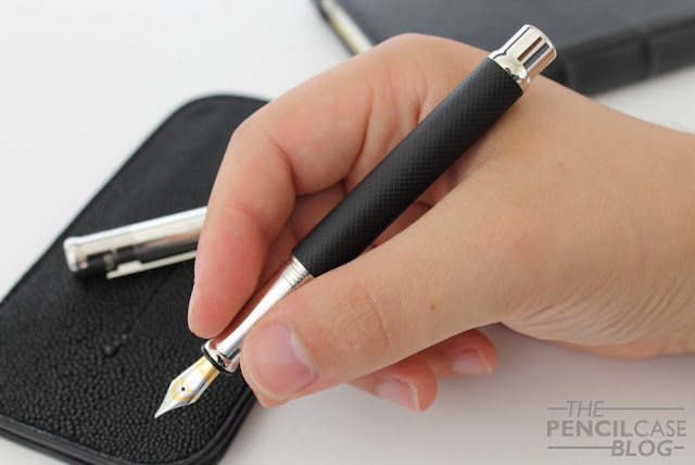
The 04 is a medium-sized pen. It measures 13.3 cm (5.2") capped, and 12.2 cm (4.8") uncapped. I always say 12.5 cm is the sweet spot for me, so this is a little below average. I don't have particularly large hands, so I can still hold it comfortably unposted, but it's pushing the limits. It's also fairly thin, at 0.9 cm around the section, and 1.05 cm at the cap and barrel. It's a full-sized pen, but it kind of leans towards a more pocketable form factor. I can imagine this would be a handy pen to use as a travel companion alongside a notebook or agenda.
Because it's an all-metal pen, it still weighs in at a substantial 35g total. The long, tapered section makes it quite comfortable to hold, even though the narrow profile is something I had to get used to (I tend to lean towards larger pens so it's slightly out of my comfort zone). There's a relatively small step behind the threads. It's noticeable when you run your finger over it. But because of the long section, it didn't interfere with my grip.
Then we get to the nib, and oh boy! It sure is worth talking about! The 04 can come with either steel or gold nibs. Both look identical, but the gold nib adds roughly 100 EUR to the cost of the pen. And frankly, I'm not sure if the gold nib is worth the premium...
But that's just a testament to how good this steel nib (#5 size) is! It's not always easy to accept that steel nibs can be every bit as good as their gold counterparts, but Otto Hutt reminds you of it by putting out a smooth, well-polished (not overpolished) and consistent nib. The feed has recesses in the tip that act as ink reservoirs to provide a consistent and wet flow. It starts right up, even when it hasn't been used for a couple days, and it never skipped on me during the weeks that I tested it.
It's a fair point to state that the Otto Hutt Design 04 is strongly influenced by Graf von Faber-Castell's design philosophy. But I don't think it should be misjudged because of it. Otto Hutt managed to make a very high-quality product that could prove to be a serious competition for GvFC. Especially at this price point! The Otto Hutt Design 04 retails for 140 EUR (167 USD) with steel nib. Gold nibs can be had (yet aren't available everywhere) for a 100 EUR premium. Prices are very fair, considering the quality you get. I don't know if I'd go the extra mile for the gold nib, just because this steel nib is so good already. (of course I haven't tried the gold nibs yet, so that opinion could change!)
Compared to the GvFC Classic fountain pen, we're talking about a third (or about half if you get an optional gold nib) of the price for one of these. From my experience with both brands, there isn't any noticeable difference in quality, so price is definitely a strong argument in favor of Otto Hutt!
Note: This product was sent to me by Pen Heaven free of charge, so I could write this review. I was in no way influenced in the making of this review, the opinions shared in this review are completely my own! This post does not contain affiliate links.


Hi again, Can you comment about the medium nib size? is a true medium or more like a Japanese medium?
ReplyDeleteHey! I'd say it's closer to a western fine than it is a 'true' western medium (although that depends strongly on what you compare it to!). So it's not far off from a Japanese medium. It has a rather wet flow though, so don't expect super fine lines!
DeleteIs the pen balanced when posted?
ReplyDeleteHey Gerard, Yes the pen is still balanced quite well-balanced when posted. The center of mass is obviously a bit more towards the back, but still within the web of my hand the way I hold it. The cap doesn't post deeply though, so it does get quite long!
DeleteThank you Dries for that information. All I need to know.
DeleteAwesome! Glad I could help!
DeleteGreat review of a beautiful pen. How has it held up?
ReplyDeleteI have five Otto Hutt fountain pens in the design four they are superb quality and those nibs just get better and better they are so smooth I can leave mine in a pen case for weeks and it always writes first time much better than the G V Faber Castell I would really recommend them you won't be disappointed
ReplyDeleteThey are fantastic pens for sure! GvFC makes excellent fountain pens too (and their gold nibs are great) but the price of the Design 04 is indeed hard to beat!
Delete