My recent experience with the Sailor Zuisei was kind of a turning point for my pen addiction. It made me realise that I had to give Japanese pens a chance. Something I hadn't done up to that point (or at least not enough), because I was strongly convinced that Japanese pens wouldn't suit my personal preferences.
But as I said, my opinion changed quite drastically with the review of the Zuisei. I was amazed by how effortless and reliable it wrote, and it could easily measure with pens of my favourite western brands. In fact, if it wasn't so expensive, I probably would've bought it! That being said, I knew it wouldn't take long before I'd venture out and look for a more affordable Sailor.
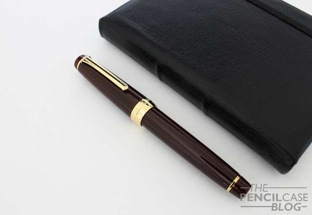
Then my eye fell upon the new Professional Gear 'Earth' special edition. I was fascinated (still am) and intrigued by the dark brown-red, murky color, and I knew that was the one I'd get. A few days later I visited Sakura Fountain Pen Gallery (based in Belgium, not too far from where I live), and I came home with one. A bit of an impulse buy perhaps, but one I don't regret so far!
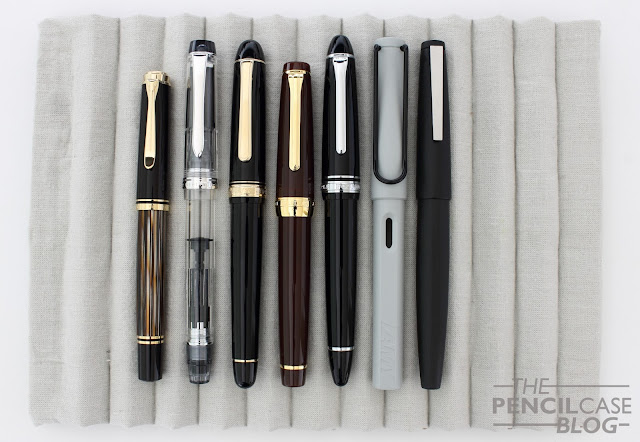
The Pro gear Earth is a special edition, and comes in the usual three sizes Sailor offers for the Professional Gear: the smaller 'Slim' (Sapporo), the normal 'classic', and the larger 'King Of Pens'. Unless you are into pocket pens, the Slim isn't really an option I'd suggest, since it is very small (the price tag is more forgiving however). The Classic is only marginally larger than the Sapporo, yet the difference is noticeable in the hand. You shouldn't, however, expect a large or oversized pen when shopping around for a Sailor, unless you spend a substantial amount more on a King Of Pens.
I've reviewed the Sailor 1911 Large some years ago, and the Pro Gear is basically identical to it, except for flat end finials. Basically they took a 1911 Large, and cut off the top and bottom, which obviously reduces the overall length of the pen quite a bit.
The Pro Gear has always been my favourite design from Sailor because of the flattop cigar design. In fact, about 95% of my collection consists of pens with flat finials, so I think it's safe to say that that's my general preference. I assume this is because pens with rounded finials usually have a more classic and traditional appearance, whereas the flattop design gives the Pro Gear a more modern look.
The Pro Gear has always been my favourite design from Sailor because of the flattop cigar design. In fact, about 95% of my collection consists of pens with flat finials, so I think it's safe to say that that's my general preference. I assume this is because pens with rounded finials usually have a more classic and traditional appearance, whereas the flattop design gives the Pro Gear a more modern look.
The pen is accentuated by gold plated trims, and a black enamel-filled anchor logo on the cap finial. The gold trims work well with the color of the resin, rhodium trims definitely would've looked out of place here. But the real eye-catcher is the wide center band: The KOP Pro Gear comes standard with a single, wide center band, but the regular Pro Gear usually has two smaller bands. Only special and limited edition versions have a single wide band.
With the Earth special edition, you can actually run into both versions, because apparently they changed it halfway during production. I had the choice when I bought mine, so I went for the wider band because I like the clean and uniform look.
 |
| The material appears more red, and shows some slight transparency in the right light |
The color of the resin on this special edition was a bit of a gamble. I didn't really know if I'd like it or not because it really is quite a strange and unique color. And frankly about two months later I still haven't really made up my mind about it. It's a muddy, dark red-brown color that somehow shows some transparency in certain places, and appears opaque in others. It also much depends on the lighting conditions, especially under artificial light it appears much more opaque. It's quite a fascinating material, and it's relatively subtle, even with the gold trims.
Now for dimensions, I already mentioned that it's quite a small pen, and that's not an understatement. It measures in at 12.9cm closed (5.05''), and 11.6cm open (4.5''). I usually find 12.5cm open (5'') to be the sweet spot that works for me, but for some reason I can just get away with this pen unposted. I do tend to hold it quite close to the nib, which makes it just long enough to not dissapear in my hand.
 |
| Unposted |
 |
| Posted |
One thing I personally really like, is that it's relatively girthy, despite not being too long. The section measures an average 1,1cm (0.43''), which helps to provide a good grip without feeling cramped. The threads are shallow and barely noticeable, and the transition from section to barrel is smooth, so there's nothing to interfere with your grip. If you can deal with the size (or lack thereof), I think it's actually a fairly comfortable pen to use. Especially posted, it's well-balanced and comfortable in the hand.
But it shouldn't really come as a surprise that it's a comfortable pen to use. Japanese brands like Sailor, Pilot,... might not always come up with the most flashy pens, but they always aim to be comfortable to use, so that's exactly what this pen delivers. Nib performance is obviously another important factor when you want a reliable everyday use pen, luckily Sailor has got that covered as well. I'm repeating myself, but the way these nibs perform just shows that they are meant to be used. They just write flawlessly, all the time. Every time.
I was blown away by the broad nib on the Zuisei, so I went with a B nib on this one as well. Japanese pens are best known for their ultra extra fine nibs, which is what a lot of people seem to enjoy these days, but Sailor also makes some pretty nice wider nibs.
Of course you shouldn't expect a wide, gushy broad like those found on a Pelikan, but it lays down a solid line, somewhere in between medium and broad. The feed provides a consistently balanced ink flow. Even with this broad nib, you can feel the distinctive feedback that indicates the nib wasn't overpolished. It starts up every time and keeps going no matter what. It's not easily bothered by oils on the page, or very slick paper, which is a nice departure from the often more finnicky Western nibs.
One thing I did notice, is that wetter, more lubricated inks perform noticeably better. Sailor's own ink is a good example of a smooth, lubricated ink, and they work well with their pens (obviously). I don't know if this is always the case, but there was definitely some noticeable difference between the inks I tried.
The Sailor Pro Gear is a small but capable pen. The design of the Pro Gear is right up my alley, but the main selling point here is of course the great writing experience. I've held off on Japanese pens because I tend to lean towards wider nibs and didn't think they would be able to provide something that would suit me. That turned out to be a bit small-minded from my end, and I definitely got rid of this preconception (I already bought a second Japanese pen since this one!). The only downside I can think of is the size of the pen itself. I find it quite a comfortable pen to use, but it's right on the edge of being a little too small, that's definitely something to keep in mind when shopping.
The regular range of Sailor pens (not including the urushi and maki-e work) quite reasonably priced (at least compared to other premium brands). The smaller Sapporo models can be had for well under 200$, while the regular size Pro Gear begins at a reasonable 295 EUR/ 250 USD, and go up from there (the Special edition Earth retails for the regular price).
Note: I received a discount on the purchase of this product from Sakura Fountain Pen Gallery, so I could write this review. I was in no way influenced in the making of this review, the opinions shared in this review are completely my own! This post does not contain affilate links.


Nice review.
ReplyDeleteA good point you've made about Western nibs when you get near the lower half of the page is that they start behaving erratically due to the oils on the page. Japanese nibs don't do this, no matter how broad they are. I think it may be because Western nibs are mostly German and they tend to over-polish them to the extent of them having no character left.
If you like broad nibs you really really should try a Sailor zoom nib. Trust me.
Thanks for the kind words! Overpolishing is definitely the issue here, and Sailor handled it very well. A sailor with a zoom or music nib is definitely on my wishlist!
DeleteYes, they do.
DeleteTheir music nibs are not up to typical Sailor quality. For the music nib I recommend the Platinum 3776 instead. The zoom nib is definitely unique and very versatile going from an ef to a bbb. Every broad lover should have one.