The clean, rounded, cigar shape in black 'precious' resin is accentuated by a flat side on the barrel that runs about a third of the length. The usual white star logo is well-represented, both on the top of the cap, and on the flat side The flat side is -how should I put this?- a distinct design choice. I don't fully grasp the benefit of it. Maybe Montblanc wanted to come up with something different? In that case, they definitely succeeded, I'm just not a huge fan.
Another, rather unique detail that I DO actually appreciate, can be found inside the cap. The closure mechanism is magnetic, but unlike other magnetic caps, the cap of the M always lines up perfectly with the flat side on the barrel. That's not just a lucky coincidence, it's actually designed to align itself (you'll notice that it won't close all the way unless it's aligned). Despite this being another, rather useless feature, my OCD definitely appreciates the correct alignment of cap and barrel!
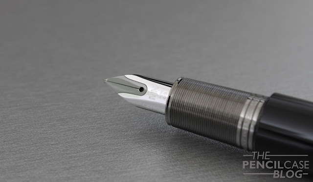
So the M is designed by Marc Newson, the man that also helps design Apple products. Apple products are designed to be user-friendly (most of the time), so I kinda expected that to be the case with this pen as well. Unfortunately it's not. My issue here is the annoyingly short and uncomfortable section.And that's exactly where Montblanc, or Newson, missed the ball completely. It's a shame really, it had potential, but as soon as I opened the cap, I knew I would be dissapointed. The section is just plain bad. it's too short, the ribbed metal provides zero grip, and the step from section to barrel is so obnoxious, it's just not comfortable to hold. Only if you have small hands, and hold your pen very close to the nib, I can see this work for you. For me it's just almost unusable.
Filling the M is also a bit of a hassle. Remember the flat side on the barrel? Well apparently, because of this 'aesthetic' design choice, Montblanc's converter won't fit. Cartridges (of the standard international variety) it is then! UPDATE: A kind reader pointed out to me that it will take certain standard-sized convertors from other brands, such as the Monteverde Converter!
Even though the M seems small in the hand for some reason, it's a solid mid-range sized pen. It comes in at just under 14cm closed, which is just a fraction shorter than the Pelikan M800, or Montblanc 146 that are in the same price category. Open, it's about 12.5cm, which is around average. The cap doesn't post at all, so if you want a larger pen, you'll be in for a dissapointment. Despite the mostly resin construction, it gains some weight from the metal section. This also means that it's noticeably front-weighted, but it's by no means heavy.
 |
| The strangest feed I've come across in a long time. It fits the overall sleek design though. |
Another issue, is of course cost. The price is high, and I personally don't think it's worth it. At 500 EUR/ 570 USD, there are far better deals to be done. The Meisterstück 146, for example, resides somewhere in the same price class, but it provides a more complete package, especially regarding comfort.
Note: I received this pen on loan, so I could write this review. I was in no way influenced in the making of this review, the opinions shared here are completely my own! This review does not contain any affilate links.


Thank you for posting the review. Quick comment: not hard to find converters that fit just fine. I had picked up a MB M several months ago at Dromgoole's in Houston. Larry Dromgoole gave me a converter to go with it. Not sure of the exact manufacturer, but it looks like some of the Jinhao converters I have seen. Fit's perfectly! I'll ask Larry next time I see him.
ReplyDeleteThanks Gordon, I've added this information to the review! Thanks again for letting me know!
DeleteThankyou. I really WANT to like this pen but I just can't justify it. I like that it's a move to something different. I like the flat area. I like the design. But it's small, a cartridge filler and expensive; sorry MB try again.
ReplyDeleteHello, what is the second pen from the right side on the sixth picture?
ReplyDeleteHello Szymon, that is the Lamy Imporium fountain pen!
DeleteI was going to ask exactly the same question - that's a very nice looking pen!
DeleteHi! Do you know what pen is the second from the left? On the sixth pic? Thank you!!
DeleteIt's the Conid Minimalistica (you can find a review about it on my reviews page under 'Conid'!)
DeleteI just purchased the rollerball version. Beautiful pen but the magnetic cap does not "perfectly align" with the star plateau. When capped, the clip is aligned with the left edge of the plateau. I've read of others having this same issue. Not sure if I should return it.
ReplyDelete